
Neighborhood Comparisons
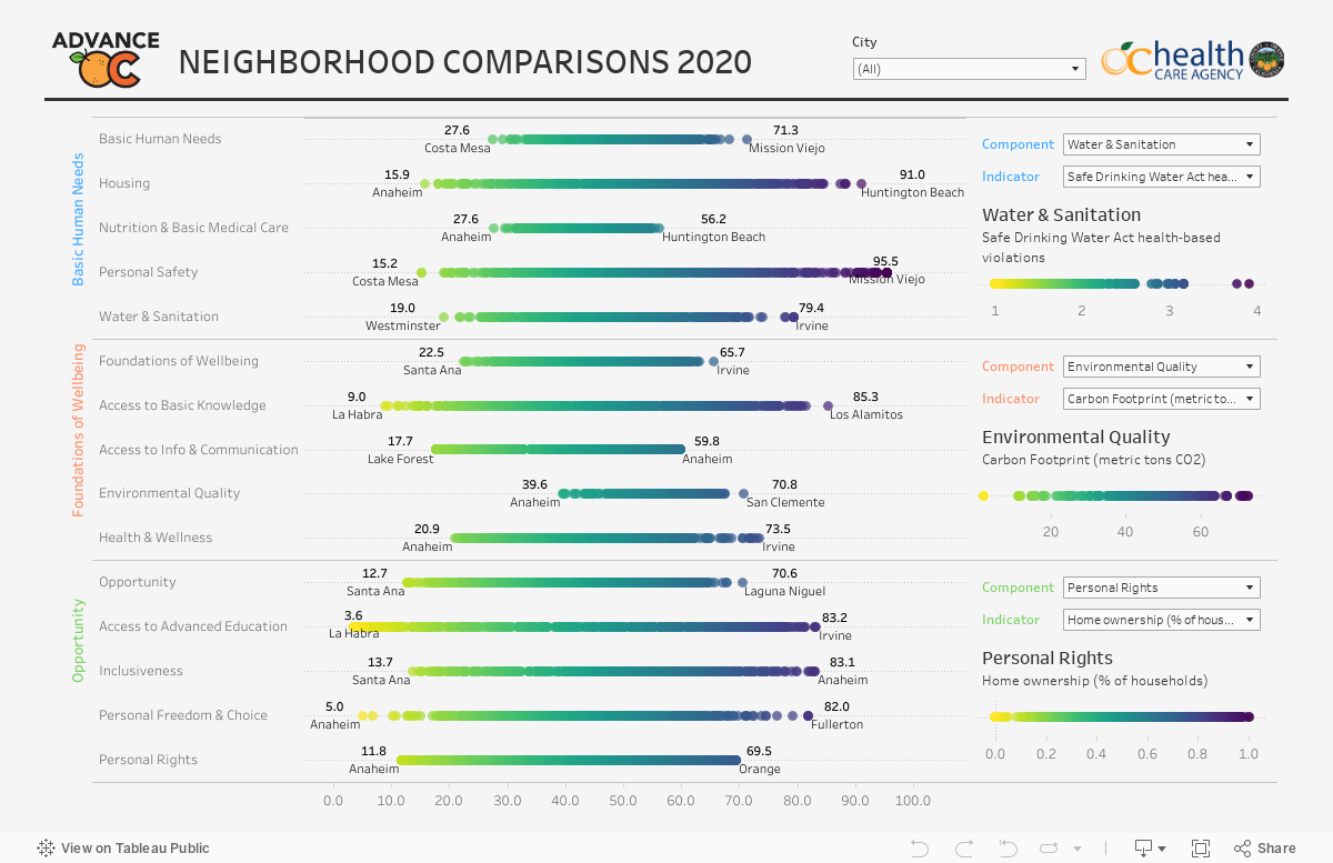
The following dashboard shows the different Social Progress Index components scores and the distribution of the lowest performing to the highest performing neighborhoods (census tracts) on a scale. The wider the distribution, the greater the disparity within that component. You can select “all” to view the distribution by county and filter by individual cities to see the distribution within a specific city or select more than one city for a regional view. On the right side of the dashboard, you can drill down to view the scale for the underlying indicators that make up each component.
The interactive graph is best viewed on larger devices.