
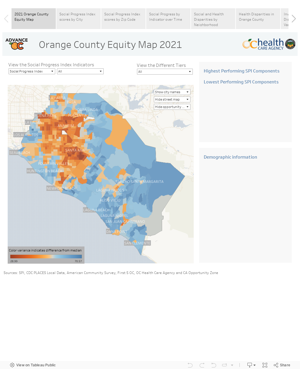
Orange County Equity Map
The Orange County Equity Map (OC Equity Map) is a data platform that spotlights social and health disparities in Orange County neighborhoods across multiple dimensions with a specific focus on the impact from COVID-19. This interactive map visualizes Orange County into 613 census tracts and displays the scores from the Social Progress Index (SPI), CDC Health Indicators, and population demographic data as well as overlays additional information that can be customized for a variety of different use cases.
The interactive graph is best viewed on larger devices.
To Navigate
Choose a Base Layer to view the corresponding map by selecting the circle next to the data marker and choosing a data stream in the drop-down menu. You can also overlay additional data by selecting one of the overlay options in the same way. All views can be segmented by city by selecting an option in the drop-down menu.
To reset the map, select the “house” icon on your left or anywhere in the grey space on the map and it will take you back to the default view. If you would like to join us for a live community Q&A session, please email info@50.112.138.57.
OC Equity Map Manual
Click on the image to the right to view the Orange County Equity Map Instructional Manual.

Important Note
The legend displays the range for the Base Layer selected. Low scores will always be yellow and high scores will always be purple. It is incorrect to always interpret yellow data points or low scores as “bad” or as a “less desirable” outcome. The legend should be viewed within the context of the data stream selected.
The interactive graph is best viewed on larger devices.
How was the Orange County Equity Map used to help ensure vaccine equity during the pandemic?
Best viewed on larger devices.
Best viewed on larger devices.